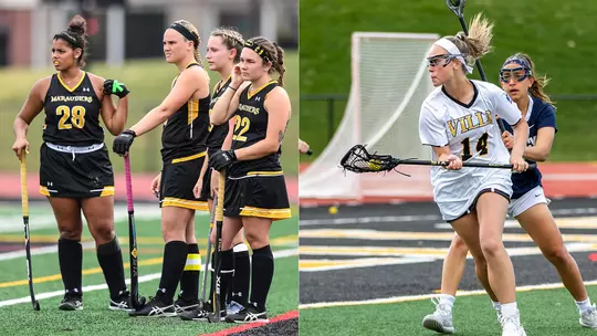
A History in Black and Gold: Part 2
Ethan Hulsey, Director of Athletic Communications
7/9/2020
A History in Black & Gold: Part One covered the stories behind black and gold as Millersville's school colors and Marauders as the mascot. Read part one here.
Almost from the very moment that athletes started choosing up sides for teams they started wearing matching uniforms, giving the team a nickname, and creating a visual representation of that team. The logo: from business to sports, logo designs and branding are now big business. The logo is the instant identifier for a faceless organization. In sports, logos are a unifying symbol--a picture of pride. Sometimes enduring, sometimes forgettable and sometimes regrettable, logos have a unique place in the evolution of sports. It’s no different at Millersville University where what has represented teams has changed over the decades.
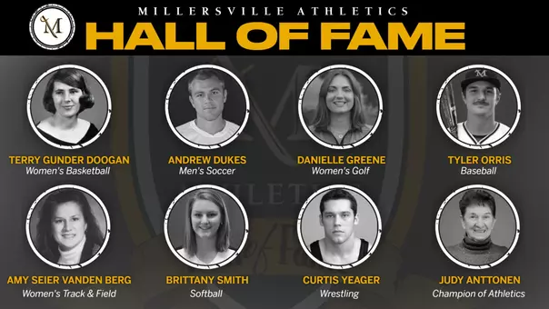
MARAUDERS THROUGH THE AGES
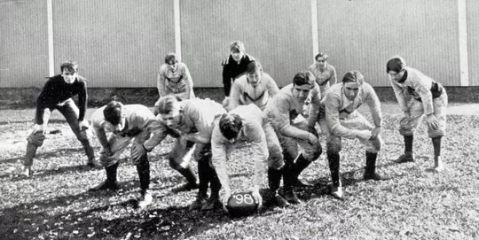
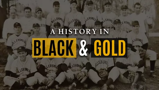
The name has changed--Millersville State Normal School, Millersville State Teachers College, Millersville State College, Millersville University—but the "M” as some form of logo has persisted into modernity. Sports arrived at Millersville with baseball in 1889 and within a decade, the teams, despite playing around four games a season, wore uniforms with “MSNS” across the chest. The 1898 football team gets credited for the first block M on a jersey, however. A team that went 4-1 and gave up just five points all season (with 15 players on the team), sported white, long sleeved collared shirts with a large M emblazoned on the front.
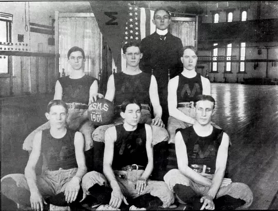
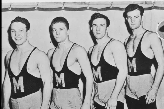
Men’s basketball followed suit in 1901 with a block M on its tank top paired with football pants and a long socks. Baseball debuted an Old English M on some of the team’s mismatched uniforms in 1908, but soon, nearly all teams (with the exception of the baseball cap) went logo-less on their uniforms until 1949 when the wrestling team debuted under the direction of Dr. Ted Rupp. The black singlet with the block M didn’t last long, however, as wrestling opted for an arched “Millersville” for the next 20 years.
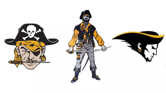
While Millersville’s sports teams had long been known as the Marauders, nothing more than a generic M and nothing resembling a standardized logo existed until the 1960s. In 1964, the men’s basketball team’s warm-up jackets featured a pirate wearing an eye patch and a skull and crossbones on a tricorn hat and a knife clenched in his teeth. This Marauder landed on the team’s shorts in 1971, and the classic pirate depiction remained a part of Millersville’s basketball uniforms for more than 30 years. Even in the early 90s, this Marauder appeared on the basketball team’s road uniform shorts. We’ll call this Marauder the first official unofficial logo of Millersville Athletics. Still, logos and typeface continued to be mix-matched, sometimes even on the same uniform. The football team went nearly a century without a logo on its helmet. In 1968, the team’s gold helmets included a cartoonish, sword fighting pirate. That logo didn’t last long. The following year, all teams wore a “100” decal commemorating the anniversary of collegiate football. Dr. Gene Carpenter arrived in 1970 and the team switched back to a solid color with black stripe down the center. The helmets remained without a logo for a decade.
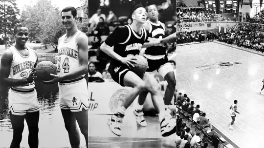
The first Millersville team to use the word “Marauders” on a jersey was men’s cross country in the early 1970s. Around 1977, a variation of the Marauder image began to appear in the University’s athletic publications and on uniforms. This bearded and mustachioed Marauder wore an eye patch and the same tricorn hat but instead of just the face appearing, this Marauder stood with a cutlass in his hands and a flintlock pistol fastened to his waist. Both Marauder depictions continued to be used by teams for the next decade-plus and became most associated with the dominating men’s basketball team of the that era. The standing Marauder (peg leg included) was even painted at center court of Pucillo Gymnasium. You can see it in living color in the 1987 PSAC Championship game archived on YouTube (get at least 15 seconds in and experience the toilet paper celebration of the game's first basket).
Around 1980 is when the University’s brand became more standardized. A very 1980s-looking MSC design started being used on all University materials, including sports uniforms.
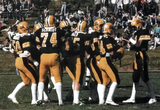
At the very same time, an iconic logo was created by a student and used exclusively on the football team’s helmets. After more than a decade with nothing but a stripe, the Marauders added a script Ville to their gold helmets. In 1984, the team switched to a black helmet and gold script Ville—a look that became synonymous with Millersville football for 20 years and represented the sport’s most successful era on campus.
The winning ways of the football team and the Marauder Pride championed by Coach Carpenter permeated the athletic department and University as a whole. By 1988, this script Ville logo, while still very unofficial, became more widely adopted. Track and field and cross country added it. The baseball team put it on its helmets. Men’s soccer’s and volleyball jerseys included the logo. Eventually, this script Ville became the look for teams until the University’s marketing department released a major re-brand for athletics 2004.
THE ACCIDENTAL DESIGNER
While the script Ville logo was (and is) beloved by alumni and can be considered nostalgic by 2020 standards, it was certainly dated by 2004. Branding and uniforms became a key element in the battle for recruits and public perception. The script Ville was neither trendy nor timeless. The University’s Director of Marketing, Elizabeth Braungard, now the Senior Director of Advancement Marketing and Communications at Towson University, looked to overhaul the image of the Millersville University. Among those working on the project was student intern Cameron Martin.
For two years, Martin had been immersed in the re-branding project, especially focused on the unveiling of the new mascot, Skully, at the Homecoming game. He sat in on some of the meetings with the athletic department and the group sought a logo design that looked good on a football helmet.
Martin was a member of the football team prior to diving into the internship so while he was not an artist, he was familiar with what worked on helmets.
“I get the simplicity of that,” said Martin. “I was thinking of some stuff on my own. It was a chance to do something important. I was trying to get a job when I graduated. It was a resume piece.”
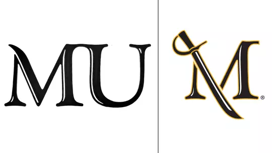
Martin, drawing inspiration from an MU logo that the University had used since the mid-90s, added a pirate cutlass sweeping downward. This was one of several doodles in a notebook, and during a meeting in Duncan Alumni Hall, Braungard saw Martin's sketch. She handed the rough sketch to then-graphic designer Wendy Shaeffer who turned the pencil drawing into a digitized logo. The logo that now represents not just athletics but the entire University, was born.
“I was a PR guy and marketing intern,” said Martin. “I’ve been called a lot of things in my life but never an artist.”
Unfortunately, Martin never thought to save the original sketch, but as a proud Millersville alum who is a member of the Millersville Alumni Board and Director of Development at Reading Hospital Foundation, Martin takes great pride in the logo, even if few know the real creator.
“I love it. It’s a sense of pride,” said Martin. “One of the branding aims was to ‘make your mark’--a legacy-type of statement. I always look back at that and say, ‘I guess I’ve left my mark.’ As an athlete, I love seeing it on the field.”
Martin’s concept, berthed with a pencil and a notebook, is now everywhere from website mastheads to billboards along highways. In the 16 years since the debut of the logo, Millersville briefly added and quickly removed a revamped Marauder (remember, some logos are regrettable). More recently, it rolled out a standardized font and Millersville Marauders word mark to provide variety and uniformity. It also brought back a Ville logo in a more timeless look, which the department has used extensively as an alternate logo. Still, none have remained quite as iconic as Martin’s logo.
DESIGN BREAKDOWN WITH AN EDUCATED EYE
Designers, those responsible for creating logos, have an educated eye and unique perspective on what makes logos work. Millersville’s Director of Web & Creative Services John Cheek (also an alum) weighed in on Millersville’s logos and color scheme.
As a designer, what are the positives and negatives about working with black and gold as the two prominent colors?
The positives of this color combination are that since the shades are so different the contrast between them is very strong. It’s a very elegant pairing. However, because gold is such a saturated color it should be used sparingly in the overall design as an accent. This brings me to the challenges of using black and gold. While this is undoubtedly one of the most classic color combos used, things can tend to start to look a bit heavy if not treated properly. There is very little neutral tonality to this combination, so you need to use tints to achieve this. Another challenge of this color combination is that so many organizations in the region have this same pairing (Pittsburgh Steelers/Pirates, Solanco School District, etc...)
What is your assessment of the current university logo and why do you think it has caught on and endured?
There is a simplicity to the saber M that allows one to quickly identify with. All great logos or marks have clear imagery and don’t need special tricks or gimmicks to get the point across. Think of some of the most recognized brands like McDonald’s, Apple or Target. There is an immediate connection to the Marauder Spirit simply by seeing the saber neatly tucked beneath the shoulder of the M.
Millersville has had variations of pirates as a logo throughout history but the two logos I think most associated with Millersville are the current logo and the script VILLE that was used through the 80s and 90s. What are issues with using a pirate or person as a logo?
As an alum (Class of 2000) I can certainly reminisce fondly on the groovy VILLE that was used in the 90s. I think it was effective for the time because that is the affectionate name that everyone who attended would have used. While we were Marauders, that was really reserved for athletics. The danger with using any person or mascot is that it can often be stereotypes or broad caricatures (as seen in the pirate logos of Millersville’s past). When we think of a Marauder, we think of a pirate sailing the seven seas pillaging, plundering and swearing as he goes. But did you know there were female pirates as well? If history tells us anything, it’s that we need to adapt to become EPPIIC to those around us. While I admire our pirate legacy, we can move the brand forward while taking into consideration what history has taught. We adapt and adjust and learn from the mistakes of the past.
What do you think is the key to creating a logo that stands the test of time?
It’s hard to quantify what makes a great logo, but when you see one you know it. The most recognized designs share a few common traits or characteristics. I mentioned this first one earlier. Simplicity. Those that can achieve a simplicity to their design will find that even as years pass, it continues to stand the test of time. The second trait is flexibility. It has to be transferable from business card to merchandise and remain flexible enough to cover all facets of a business. The third trait is transportive. Your logo represents your company, everything it stands for and the audience you’re trying to reach. This is where the attention to understanding your brand plays a huge part in the overall design. With the right logo, you’ll be able to communicate the right message and tone.